Won't somebody think of the children
Let’s begin by looking at what the road network looks like if all children in Williamstown and Newport went to school by car
Now I know what you’re thinking, that’s a pretty cool animation! And you’re right. But that’s not the point of this post.
Some assumptions
Most people would argue that healthy and active kids is a good thing. And in my own personal echo chamber of social media I see a shift in perceptions towards cycling as a viable method of commuting, and a move away from cars as the go-to method for getting kids to school.
So if we all agree that being active is good, keeping children healthy is good, and keeping them safe on their way to school is good, how do we give governments and councils the impetus to build infrastructure to support this?
Pandemic to the rescue!
It’s taken a global pandemic for Melbourne to fast track 40km of protected bike lanes in the city. Which is great for the city (not withstanding we’re not supposed to be going to offices at the moment). But what about the children?
How do councils know where they cycle, or where they would cycle if they weren’t in a car?
With our Twin Cities data we can model each child* as they travel to school. And I’ve highlighted the word data because that’s what it is; it’s a data product covering the whole of Australia, and not just an animation of a small area.
*statistically speaking, not literally every child, that would put us on the wrong side of all kinds of laws and morals.
This gives us a lot of power as we can answer questions such as
- What routes are used for cycling to school?
- What routes would be used if children cycled to school?
- How much time is each child in close proximity to a car while cycling?
- How much less traffic would there be on the roads?
- Where should protected bike lanes be installed?
A hypothetical example
If we were to make an assumption that 40% of children cycled to school, and the remaining by car, we can say with a good deal of confidence which routes they would likely take, and therefore how long they would spend on the same roads as vehicles.
Here we see this split of cyclists (green) and cars (purple) on their way to school
The nice thing about this animation is you can see hot-spots of where and when cyclists and vehicles mix.
For example, take this snapshot between 08:45 - 09:00. You can see for each school (bold circle) there’s a mix of green (bike) and purple (car) lines sharing the same piece of road. With a more intense colour showing more cars and / or bikes are on that section of road.
And obviously there is underlying data driving this map that we can use to answer those questions above, plus any others you can think of.
And because I was experimenting with different ways of visualising this, here’s a ‘coral’ plot showing the same data
The height of each path represents the journey time to school. So you typically see the green (bike) paths start higher than the blue (car) paths because the journey takes longer.
And if you rotate the map (hold Ctrl & drag) so you’re looking from the top-down you see the paths overlaid on top of each other.
That’s great for Williamstown, but what about where I live?
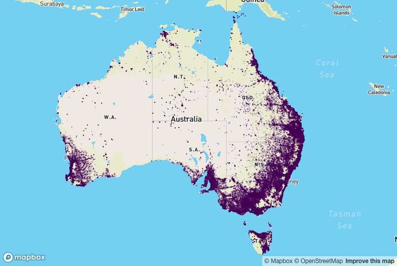
A very good question you ask. And we’ve got you covered. Our Twin Cities data covers the whole of Australia

(This is not interactive because I didn’t want to overload your browser with too much data)
If you want to explore our Twin Cities data in more detail we have a dashboard where you can view numbers and demographics for various regions (currenly only in Victoria), and the accompanying blog post giving a bit more detail.
Any questions?
Get in touch if you want to explore the data in more detail, or talk about how this data can help you.
